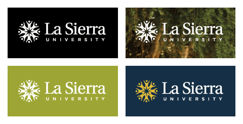
The University Logo
The La Sierra University logo is a symbolic combination of our motto (“from diversity, community”) and our aim (“to seek, to know, to serve”), expressing many dimensions of identity. Unlike the University seal, which indicates official academic sanction, the logo represents the University’s image and visual characteristics.
Often referred to as the “sunburst,” the logo’s symbol is made up of individual figures forming a circle. The figures express our various kinds of diversity—of basic functions (teaching, learning, service), of individual backgrounds (ethnic, cultural, religious, educational), of intellectual disciplines (academic, professional, vocational), and of singular personalities (abilities, interests, temperaments). The circle in which the figures are arranged expresses the underlying unity enriched by our diversity—the unity of our ultimate values (faith, integrity, courage, compassion), our fundamental attitudes (trust, respect, openness), and our primary activities (learning, worship, service). The proximity of the figures in the circle formation expresses our connectivity and interrelatedness. Their attitude of joyful worship reflects our conviction that faith is an essential part of learning, and that learning is an essential part of faith.
The general impression of a sun expresses the greatest goal of La Sierra University—to enhance the light of God’s truth and the warmth of His love in all of its people, in its sponsoring church, and in the surrounding world.
Logo Colors
The logo may be reproduced in:
- All black
- All blue (PMS 2965)
- Yellow (PMS 7406) and blue (PMS 2965)
- Yellow (PMS 7406) and white (see guidelines below)
- All white (see guidelines below)

Reversing to White
Reversing the logo to all white is allowed when applied to colors from the approved University color palette or to appropriate photographs that are not complicated or busy. The logo may only be used in yellow and white on a background of University navy (PMS 2965). Reversed versions of the logo can be found at the Download Center.
Sizing and Reproduction
Signature
The La Sierra University logo is the University's official identifier and the appropriate symbol for use on all forms of visual communication. The logo (signature) of the University consists of the wordmark (La Sierra University) and the symbol (sunburst).
The wordmark should always be used with the symbol in the configuration shown above. The symbol may be used alone as a graphic element or watermark. See the Graphic Elements page for guidelines on using the symbol in this way.
Positioning Statement
2-Line Variation
Christian Faith, and Service to Others Unite
Logo Variation
When using with the La Sierra University logo, use the 4-line variation: 
3-Line Variation
Christian Faith, and
Service to Others Unite
4-Line Variation
Investigation, Christian
Faith, and Service
to Others Unite
Placement
The logo should be clearly and prominently displayed, and may not be altered or reconfigured in any way. It should be displayed on all visual communications and may not be used as part of a headline or running text.

The logo should be positioned at least 1/4 (.25) inch from the end of a page, gutter, or border, depending on page dimensions or publication design. 1/8 (.125) inch of clear space must be maintained around the logo.

 Loading interest form...